<html>
<head>
<meta http-equiv="Content-Type" content="text/html; charset=UTF-8">
<title>CSS3按钮导航Dark Navigation Buttons - HTML5中文网站</title>
<style>
/* The following styles are used only for this page - the actual plugin styles are in slidernav.css */
* { margin: 0; padding: 0; }
body { background: url(bg.gif); }
#content { padding: 40px 20px; font-family: "Helvetica Neue", Helvetica, Arial; font-size: 12px; line-height: 18px; color: #cfdae3; }
a { text-decoration: none; }
h2, h3 { margin: 0 0 20px; color: #fff; }
h2 { font-size: 28px; }
h3 { font-size: 22px; }
pre { background: #fff; width: 460px; padding: 10px 20px; border-left: 5px solid #ccc; margin: 0 0 20px; }
p { width: 500px; font-size: 18px; line-height: 24px; margin: 0 0 30px; }
input { margin: 0; padding: 0; }
/* Dark Button CSS */
.button {
outline: 0;
padding: 5px 12px;
display: block;
color: #9fa8b0;
font-weight: bold;
text-shadow: 1px 1px #1f272b;
border: 1px solid #1c252b;
border-radius: 3px;
-moz-border-radius: 3px;
-webkit-border-radius: 3px;
background: #232B30; /* old browsers */
background: -moz-linear-gradient(top, #3D4850 3%, #313d45 4%, #232B30 100%); /* firefox */
background: -webkit-gradient(linear, left top, left bottom, color-stop(3%,#3D4850), color-stop(4%,#313d45), color-stop(100%,#232B30)); /* webkit */
filter: progid:DXImageTransform.Microsoft.gradient( startColorstr='#3D4850', endColorstr='#232B30',GradientType=0 ); /* ie */
box-shadow: 1px 1px 1px rgba(0,0,0,0.2); /* CSS3 */
-moz-box-shadow: 1px 1px 1px rgba(0,0,0,0.2); /* Firefox */
-webkit-box-shadow: 1px 1px 1px rgba(0,0,0,0.2); /* Safari, Chrome */
}
.button:hover {
color: #fff;
background: #4C5A64; /* old browsers */
background: -moz-linear-gradient(top, #4C5A64 3%, #404F5A 4%, #2E3940 100%); /* firefox */
background: -webkit-gradient(linear, left top, left bottom, color-stop(3%,#4C5A64), color-stop(4%,#404F5A), color-stop(100%,#2E3940)); /* webkit */
filter: progid:DXImageTransform.Microsoft.gradient( startColorstr='#4C5A64', endColorstr='#2E3940',GradientType=0 ); /* ie */
}
.button:active {
background-position: 0 top;
position: relative;
top: 1px;
color: #fff;
padding: 6px 12px 4px;
background: #20282D; /* old browsers */
background: -moz-linear-gradient(top, #20282D 3%, #252E34 51%, #222A30 100%); /* firefox */
background: -webkit-gradient(linear, left top, left bottom, color-stop(3%,#20282D), color-stop(51%,#252E34), color-stop(100%,#222A30)); /* webkit */
filter: progid:DXImageTransform.Microsoft.gradient( startColorstr='#20282D', endColorstr='#222A30',GradientType=0 ); /* ie */
-moz-box-shadow: 1px 1px 1px rgba(255,255,255,0.1); /* Firefox */
-webkit-box-shadow: 1px 1px 1px rgba(255,255,255,0.1); /* Safari, Chrome */
box-shadow: 1px 1px 1px rgba(255,255,255,0.1); /* CSS3 */
}
/* Other stuff: */
.button-list { list-style: none; padding: 0; margin: 0; width: 100%; float: left; display: block; margin: 0 0 30px; }
.button-list li { float: left; margin: 0 10px 0 0; }
.button-list li.search { border-left: 1px solid #273137; padding-left: 18px; margin-left: 10px; position: relative; }
/* Search CSS: */
.search-input {
padding: 0 5px 0 22px;
border: 1px solid #1c252b;
height: 30px;
color: #9fa8b0;
font-size: 12px;
line-height: 30px;
font-weight: bold;
text-shadow: 1px 1px #1f272b;
border-radius: 25px;
-moz-border-radius: 25px;
-webkit-border-radius: 25px;
background: #20282D; /* old browsers */
background: -moz-linear-gradient(top, #20282D 3%, #252E34 51%, #222A30 100%); /* firefox */
background: -webkit-gradient(linear, left top, left bottom, color-stop(3%,#20282D), color-stop(51%,#252E34), color-stop(100%,#222A30)); /* webkit */
filter: progid:DXImageTransform.Microsoft.gradient( startColorstr='#20282D', endColorstr='#222A30',GradientType=0 ); /* ie */
-moz-box-shadow: 1px 1px 1px rgba(255,255,255,0.1); /* Firefox */
-webkit-box-shadow: 1px 1px 1px rgba(255,255,255,0.1); /* Safari, Chrome */
box-shadow: 1px 1px 1px rgba(255,255,255,0.1); /* CSS3 */
}
.search-input:focus {outline: none;}
.search-submit {
width: 13px;
height: 13px;
border: none;
background: url(mag-glass.png) no-repeat;
display: block;
position: absolute;
left: 26px;
top: 10px;
text-indent: -9999em;
}
/* Vertical List: */
.vertical-list {
list-style: none;
padding: 10px;
width: 200px;
border-radius: 5px;
-moz-border-radius: 5px;
-webkit-border-radius: 5px;
background: #20282D; /* old browsers */
background: -moz-linear-gradient(top, #20282D 3%, #252E34 51%, #222A30 100%); /* firefox */
background: -webkit-gradient(linear, left top, left bottom, color-stop(3%,#20282D), color-stop(51%,#252E34), color-stop(100%,#222A30)); /* webkit */
filter: progid:DXImageTransform.Microsoft.gradient( startColorstr='#20282D', endColorstr='#222A30',GradientType=0 ); /* ie */
-moz-box-shadow: 1px 1px 1px rgba(255,255,255,0.1); /* Firefox */
-webkit-box-shadow: 1px 1px 1px rgba(255,255,255,0.1); /* Safari, Chrome */
box-shadow: 1px 1px 1px rgba(255,255,255,0.1); /* CSS3 */
}
.vertical-list .button {
border-radius: 5px;
-moz-border-radius: 5px;
-webkit-border-radius: 5px;
background: #515B62; /* old browsers */
background: -moz-linear-gradient(top, #515B62 3%, #444E55 5%, #394147 100%); /* firefox */
background: -webkit-gradient(linear, left top, left bottom, color-stop(3%,#515B62), color-stop(5%,#444E55), color-stop(100%,#394147)); /* webkit */
filter: progid:DXImageTransform.Microsoft.gradient( startColorstr='#515B62', endColorstr='#394147',GradientType=0 ); /* ie */
}
.vertical-list .button:hover {
background: #5F6B72; /* old browsers */
background: -moz-linear-gradient(top, #5F6B72 3%, #56646C 4%, #4D5A62 50%, #434D54 100%); /* firefox */
background: -webkit-gradient(linear, left top, left bottom, color-stop(3%,#5F6B72), color-stop(4%,#56646C), color-stop(50%,#4D5A62), color-stop(100%,#434D54)); /* webkit */
filter: progid:DXImageTransform.Microsoft.gradient( startColorstr='#5F6B72', endColorstr='#434D54',GradientType=0 ); /* ie */
}
.vertical-list .button:active {
padding: 5px 12px;
top: 0;
background: #515B62; /* old browsers */
background: -moz-linear-gradient(top, #515B62 3%, #444E55 5%, #394147 100%); /* firefox */
background: -webkit-gradient(linear, left top, left bottom, color-stop(3%,#515B62), color-stop(5%,#444E55), color-stop(100%,#394147)); /* webkit */
filter: progid:DXImageTransform.Microsoft.gradient( startColorstr='#515B62', endColorstr='#394147',GradientType=0 ); /* ie */ -moz-box-shadow: 1px 1px 1px rgba(255,255,255,0.1); /* Firefox */
-moz-box-shadow: 1px 1px 1px rgba(0,0,0,0.2); /* Firefox */
-webkit-box-shadow: 1px 1px 1px rgba(0,0,0,0.2); /* Safari, Chrome */
box-shadow: 1px 1px 1px rgba(0,0,0,0.2); /* CSS3 */
}
.vertical-list li { margin: 0 0 5px; }
.vertical-list li:last-child { margin: 0; }
</style>
</head>
<body>
<div id="content">
<h3>Dark Navigation Buttons</h3>
<ul class="button-list">
<li><a href='/' class='button' onClick="return false;">Home</a></li>
<li><a href='/' class='button' onClick="return false;">About</a></li>
<li><a href='/' class='button' onClick="return false;">Portfolio</a></li>
<li><a href='/' class='button' onClick="return false;">Blog</a></li>
<li class="search"><input type="text" class="search-input" name="search" value="Search" /><input type="submit" class="search-submit" /></li>
</ul>
<h3>Vertical Menu:</h3>
<ul class="vertical-list">
<li><a href='/' class='button' onClick="return false;">Home</a></li>
<li><a href='/' class='button' onClick="return false;">Our Studio</a></li>
<li><a href='/' class='button' onClick="return false;">Portfolio</a></li>
<li><a href='/' class='button' onClick="return false;">Our Team</a></li>
<li><a href='/' class='button' onClick="return false;">Get in Touch</a></li>
</ul>
</div>
</body>
</html>
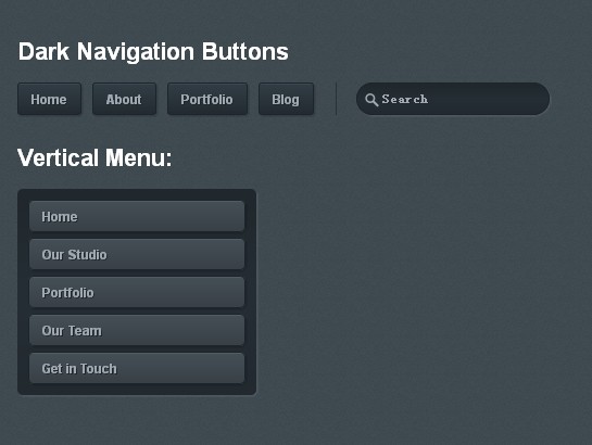
效果:
下载链接:http://www.codefans.net/down/18477.shtml